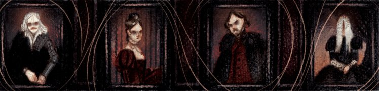
Angela Carter’s writings have been illustrated on numerous occasions and by a wide range of artists. Her lush prose and vivid imagery, coupled with her often surreal and disturbing scenarios, are no doubt largely responsible for the enormous body of fan art that has emerged over the last decade or so. Recently, I had the pleasure of talking with one such artist, Morrighan Corbel, who has created a series of artworks based on two stories from Carter’s celebrated collection The Bloody Chamber and Other Stories (1979).
Caleb Sivyer: I would like to begin by asking you to tell me a bit about ‘Blood and Roses: An Angela Carter Illustration Project’. What is the project about and how did you come up with it?
Morrighan Corbel: ‘Blood and Roses’ is my final major project for my illustration degree – a project I built and fulfilled over my final year. My idea behind it was that this was my 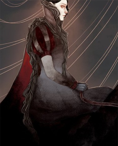 last chance to really push myself with a large scale project without having to worry about the financial implications so much – university offers a really interesting space to push your work to its extremes without having the pressure of it having to necessarily be commercially viable. I wanted to work on something I was passionate about and explore my love of different forms of narrative illustration, and I’d been eyeing up The Bloody Chamber for a year or so beforehand because I knew it would suit the direction my work was going, so I decided it was the perfect opportunity to do something with the text. That something ended up being a comic adaptation of ‘The Snow Child’ and an illustrated prose version of ‘Lady of the House of Love’, both of which I had bound into a hardback leather book. Through the Kickstarter I also ended up making hardback zines of my favourite illustrations, prints, bookmarks, and enamel pins. It was a lot of work to complete to deadline, but I never once regretted having so much to do because I loved creating it all.
CS: Looking at the various images, it’s very clear that a lot of work went into these two projects as each image is full of intricate detail. How long did each one take? What were some of the challenges involved in producing each piece?
MC: On average, the smaller images took around ten hours: six to render and around four to colour. I work in mixed media, which means I start with traditional rendering in greyscale. Usually this means a layer of black watercolour to start establishing tones within the composition, and then a layer of graphite powder to begin rendering forms. I especially like starting with powder for faces as I feel it helps me to establish good structure and form. I then work up the image with varying graphite leads, from a light 6H to a very dark 8B. I try to work from big shapes to small details, but sometimes with a complex image I have to render everything in sections instead. For colour, I scan the image at about 600dpi and then take it into Photoshop. I use a lot of colour layers and for this project I tried to restrict myself to a very limited colour palette to keep all the images uniform throughout the book. Working this way allows me a lot of flexibility with colour choices and effects, and this certainly helps when I feel an image just isn’t working – there were a few images in the project where I recoloured them entirely because things just weren’t going the way I wanted them to.


A big challenge was trying to decide how the book was going to look stylistically, especially in the development stages. It took me a long time to figure out how I wanted to work and what process I needed to use for each piece, and it was extremely stressful. During development I felt very unsure of my skills and I would go to bed at night worrying about what would happen if I couldn’t produce work of a quality I felt proud of. It took a last ditch attempt to loosen up and experiment to finally crack how I wanted to work. A lot of my biggest art breakthroughs have come after a period of intense stress and dissatisfaction, and it’s usually the “I can’t do this anymore! I have to find something new that works!” desperate stress that helps me to improve my skills in a way I can take forward.
“The colours were especially important to me as they helped me set the mood for each piece and create the right atmosphere”.
Another challenge was making sure all the images worked together. The book contained two very different stories and I wanted to make sure that someone who didn’t know my work could see any two images out of context and know that they were by the same person and for the same purpose. To help me with this I kept a few different elements consistent throughout all the work: the fonts I chose, certain things like the roses, and the colours. The colours were especially important to me as they helped me set the mood for each piece and create the right atmosphere, and keeping them limited to a very specific palette with very specific layer types meant that all the images worked together as a collective whole- they all had a unifying element.
CS: “Blood and Roses” is crowd-funded through Kickstarter. Is this the first time you’ve tried crowd-funding? If so, what has your experience been of this platform? What was the response to “Blood and Roses”?

MC: Kickstarter was a last minute decision for me. I realised I needed a way to fund my printing for the physical books, and this gave me a great opportunity to try Kickstarter for the first time. I was really nervous about it, but I figured that as long as I worked really hard to push the project it had an alright chance of funding, and if it didn’t fund I’d just find another way to do the printing – maybe scale back my ideas for the final products. I was expecting it to be really difficult, so I made sure to promote the project everywhere I could think of before it launched to give it the best chance of being picked up. Clearly it worked, because once the project launched it was fully funded within six hours! I was absolutely thrilled. Kickstarter is incredible – it’s hard work, and there’s a lot of preparation that goes into a campaign, and a lot of work done during, and a lot of work done after, but having a platform where the people who love your work and want to support you can help do that so tangibly is a game changer. Seeing friends, fellow artists and loved ones pledge money alongside total strangers who just thought the project was worth their time and contribution is mind-blowing. It really put things into perspective for me, and it really makes you feel like the work that you’ve done not only for the project but to market yourself and build your audience has been worth it.
CS: Based on your experience, would you use crowdfunding again? What are your thoughts on it in general? More and more artists and content producers of every kind appear to be turning to websites like Kickstarter and Patreon.
“I really think that crowdfunding websites like Kickstarter, and longer term subscription models like Patreon, are revolutionising the way artists work.”
MC: Yes! I’d love to run another crowdfunded project. Working on ‘Blood and Roses’ has really proven that even without a massive social media following (I have just under 1,500 followers on Twitter, and a negligible amount anywhere else) you can run a project that is massively successful in its own right. I really think that crowdfunding websites like Kickstarter, and longer term subscription models like Patreon, are revolutionising the way artists work. It turns our personal work – our love affairs, our passion projects, the stuff that’s just too weird to be commercially viability – into ways to generate income, build an audience, and find a community of people who love the things that we love. For the first time, artists don’t have to work for a traditional commercial market of big, potentially exploitative companies; we can make the work we truly want to make pay for itself, and that’s very exciting. I’ll definitely be using crowdfunding in future, and I’ll be watching with great excitement how other artists and creators use different platforms.
CS: How did you become interested in Angela Carter’s work and what was the first thing you read of hers?
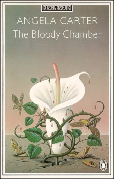
MC: My first introduction to Angela Carter’s work was The Bloody Chamber, during my English A-Levels. It was one of our set texts and so I read the whole thing, cover to cover, and immediately fell in love. It was a transformative read for me as a storyteller – I’ve been a fan of the gothic since I was a child but I hadn’t encountered many gothic texts that really spoke to me. Carter’s work is raw and beautiful and horrific all at the same time, and she has a way with her prose that immediately conjured ideas and images into my head. I’d never read anything that stimulated my imagination so fervently, and I knew immediately that these were the kinds of stories I wanted to create myself, and that there was a place for them. It really changed how I approached my own stories.
CS: Have you read other works by Carter and if so would you consider illustrating any of them?
MC: I haven’t yet. I’d really like to, but recently my time for reading has been pretty limited. I can also be quite picky with my fiction: I like historical settings and it takes a lot for me to sit down and read fiction without immediately being overwhelmed by the urge to create. The wonderful thing about illustrative adaptations, though, is that you can change the imagery and setting at will to enhance the story. It’d be wonderful to maybe take one of her stories and completely adapt the setting and stage to create something new. I’m especially interested in Black Venus, especially the historically based aspects. For now, though, I want to focus on my own original work.
CS: How did you decide which of Carter’s works you wanted to illustrate?
MC: It took a while. I was originally going to try and illustrate all of the stories in The Bloody Chamber collection, but I quickly realised that that would firstly be an impossible amount of work, and secondly that when I started thinking about visual adaptations of the stories, certain stories spoke to me far more than others. ‘The Snow Child’ has always interested me because it’s only a page and a half of prose, but when I started thinking about the way I saw it in my head, it’s very visually rich. There’s so much imagery and symbolism worked into the story that I knew it would work perfectly for a longer form comic – there’s enough packed in that I could find something to draw for every line, and the prose is so visual and visceral that I barely had to think about what should be on each page. It almost thumbnailed itself. ‘Lady of the House of Love’ took me back to one of my first year illustration projects when I worked on illustrations for Dracula. That project was a real passion project for me, and set me on the path to Gothic horror, and I felt like it was very fitting that part of my last project should be a similar theme and story, and another complete labour of love – a sort of beginning and end comparison to my time at university. I really love looking at those two projects together and seeing how my work has changed and grown, but how my love of Gothic romance and tragedy has become such a defining part of my work.
“[Angela Carter’s] ‘The Snow Child’ has always interested me because it’s only a page and a half of prose […] There’s so much imagery and symbolism worked into the story”.
CS: You mentioned Dracula just now. Have any other Gothic texts had a big influence on your work? Carter was very interested in Edgar Allan Poe’s work – does his work, for example, speak to you too?
MC: I do enjoy classical literature. Poe is an incredible writer and I love supernatural horror. Mary Shelley’s Frankenstein is also a favourite of mine, and her life was just as gothic and dramatic as any of her writing. Gothic texts are a relatively new haunt to me. I used to be very into fantasy as a child, and it’s only recently that I’ve begun to embrace a love of supernatural horror. I’m also interested in how different cultures do horror. I’m a big fan of Junji Ito and his works, and Maasaki Nakayama’s Fuan No Tane kept me awake for days and really informed how I approach tense, psychological horror. I describe his kind of horror as “refusing to look out of windows when it’s dark, because you just know you’ll see something that shouldn’t be there.” It plays on your deepest fear of the unnatural and the unexplainable.
CS: How did you get started as an illustrator? What other texts have you illustrated in the past?
 MC: I decided I wanted to do something in art around the age of thirteen. I met my wonderful partner around that time and he introduced me to the manga and comics and illustration that really developed my passion for drawing. I didn’t know that I wanted to do illustration until I was in my Art Foundation year of college, though. I’d had a really rough time of my A-Levels and I felt very lost, so I decided I wanted to do a year long Art Foundation to really explore visual creativity and maybe find what I wanted to at university. It was an amazing year: I got to experiment so much, and really take the time to find what I was passionate about. At the time, I was getting more and more into comics, and after producing my first comic at the end of that year, I decided I wanted to do illustration and build up my skills to keep pursuing ways of exploring narrative in artwork. That’s been my main focus through university: during my first year, I illustrated Dracula, and in my second year I did a self-negotiated adaptation of Robert Browning’s poem, Porphyria’s Lover. ‘Blood and Roses’ is my third narrative project. For my next, I intend to start working with my own stories.
CS: Could you talk about the design of your illustrations? You use a combination of image and text. How did this decision come about?
 MC: My decision to combine prose and image has mostly come about through the influence of other illustrators and comic artists – I really loved Emily Carrol’s Through The Woods, and especially the way she plays with text and panels. I’ve never much liked the look of speech bubbles in comics, and since prose is very different to dialogue, it requires a different approach. I also read Pam Smy’s Thornhill during my research, and that really inspired me with its combination of traditional written prose and double spread illustrative comic pages. I love seeing new ways of approaching comics and story and seeing other artists play and take risks inspires me to do so too.
CS: Given the long history of fairy tale illustrations, have you been inspired by any of the classic illustrators?
MC: Yes, a lot of my inspiration comes from classical fairy tale illustrators. Artists like Arthur Rackham, the Pre-Raphaelites, and Angela Barrett were some of my earliest influences when it came to developing my own art style – there’s a lot to be learned from illustrators whose work has stood the test of time. As well though, I love seeing what new and contemporary artists are doing within the fantasy and fairy tale genres. Iris Compiet, Emily Carroll, and Becky Cloonan have all inspired my own work, and it gives me great joy that there’s still such demand for fairy tales and fantastical stories.
“A lot of my inspiration comes from classical fairy tale illustrators. Artists like Arthur Rackham, the Pre-Raphaelites, and Angela Barrett were some of my earliest influences when it came to developing my own art style.”
CS: What are some of the challenges involved in illustrating Angela Carter’s writings? I’m thinking, for example, of the eroticism and violence of some of her stories, such as ‘The Snow Child’.
MC: Carter isn’t afraid to shy away from controversial topics and difficult symbolism in her work, and that presents some interesting problems when visually adapting her work. ‘The Snow Child’ especially is very visceral, and I had to really consider how to depict the events of the story in a way that still gives the full impact, but isn’t tasteless or overtly grasping for shock. Generally, when faced with something uncomfortable to draw, I try to find a single element of the scene that tells the reader what is happening but is not overly explicit, for example, a drop of blood, or a clenched hand around a limp wrist. Symbolism is important to Carter’s work and it can also be very useful in illustration for adding extra depth to an image when there’s a complex or graphic scenes. I enjoy the challenge of finding a new way to approach an illustration when simply depicting what is happening would be too much.
CS: How can people get access to your illustrations? Are they for sale and/or are they available to view online?
MC: My favourite images for the project are on my website, at www.morrighancorbel.co.uk, and I post very frequently on social media, especially Twitter. Right now, my Etsy is offline for an update and to give me time to make new stock. My work has progressed so much in my time at university that I felt it was time to give my shop a break and make some new work that reflects my current style better. When it comes back online, I’ll post it around. I also do UK comic conventions very regularly, though again I’m taking a year out through 2018 as I have some intense life changes coming up and I want to make sure I’m in the best place possible to return with a vengeance in 2019!
CS: Now that Blood and Roses is finished, what’s next for you?
MC: The plan was to move back to my home city once I’d graduated, but ‘Blood and Roses’ has actually led to me being offered a job with a software company in the North East, so I’ve moved back to Newcastle for the foreseeable future. I’ll mostly be settling into my new job, and new house, but I’m also making plans for a new comic this year that will be based on an original story of mine, and I’d also like to develop a long term documentation project based around my collection of antique photographs. I’m looking forward to having a bit of a break, but I can never sit still for long!
CS: Thank you for your time Morrighan.
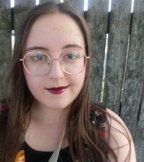 Morrighan Corbel is a British Gothic horror illustrator, comic creator, and designer based in the North East of England. Heavily inspired by fairy tales, mythologies, and psychological horror, Morrighan creates beautiful and ethereal images which explore the tantalising and the terrible. Having just graduated from a North East arts college, Morrighan plans to spend the rest of the year creating personal work and settling into post-graduate life. When she’s not at her home studio, Morrighan can be found in the wilds of Newcastle, living somewhere between art shops, comic shops, and antiques stores. She hopes to release a new, original comic in 2019.
All artworks are copyrighted by Morrighan Corbel. Please visit www.morrighancorbel.co.uk to see more of her work.

Great reead
LikeLike